Mawer – “It Pays to Be Boring” Campaign
A long-term investment philosophy brought to life through a bold, disciplined visual system.
Campaign design: Joseph Rivera
Agency: Living Group

2025 Gramercy Institute Asset Management Marketing Awards Winner - Creative
Individual Investor Targeted
The Brief
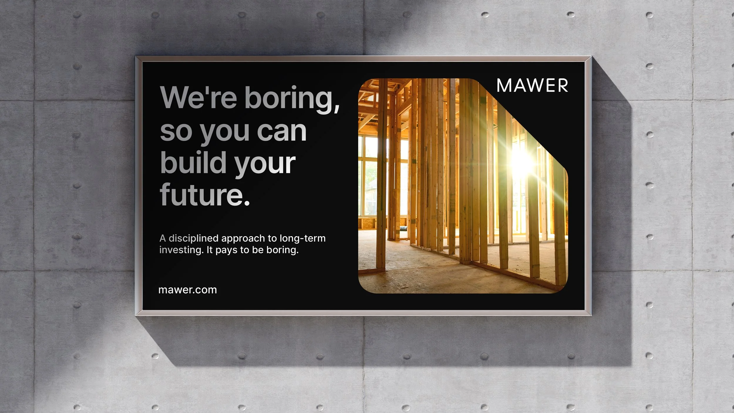
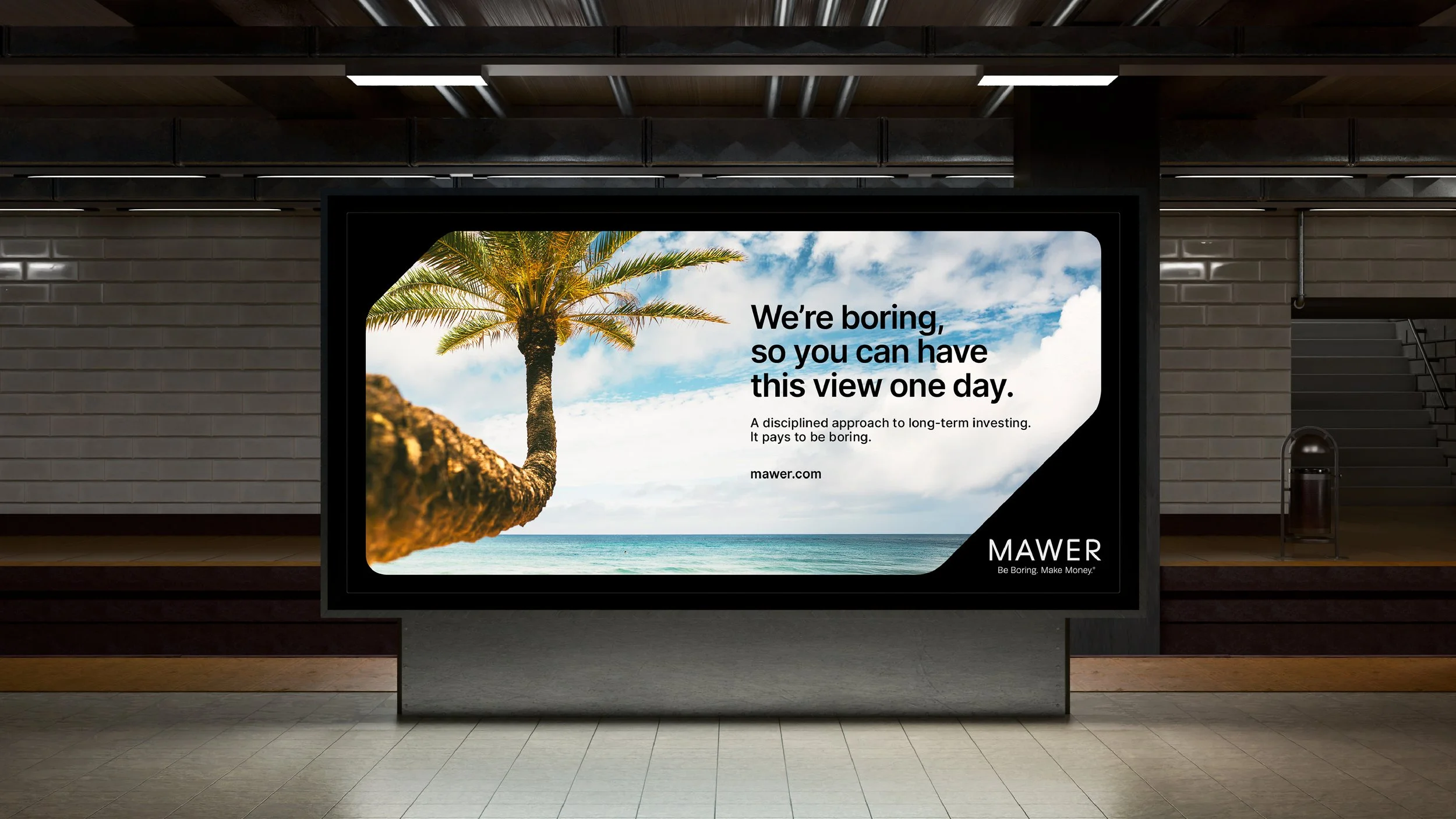
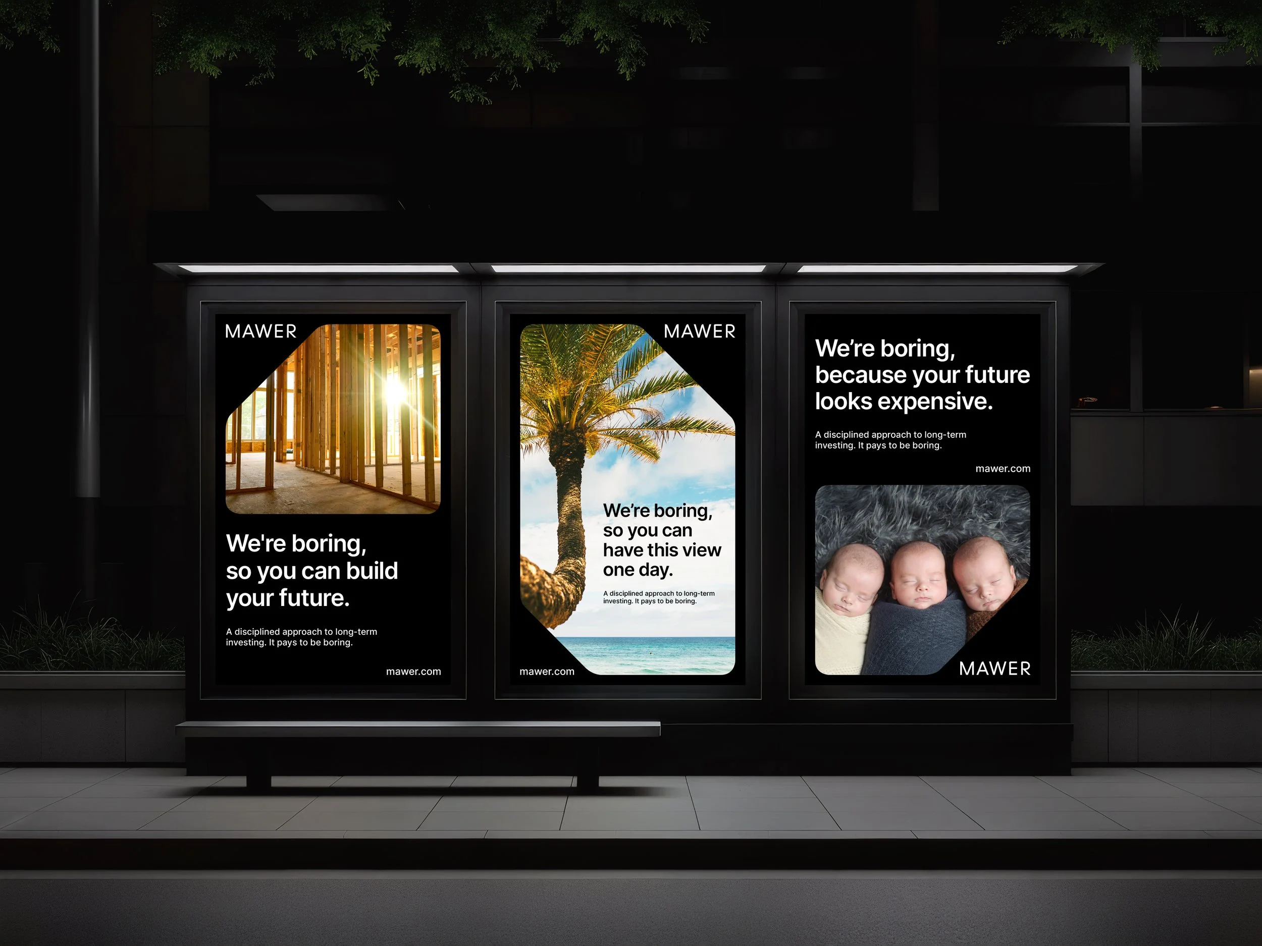
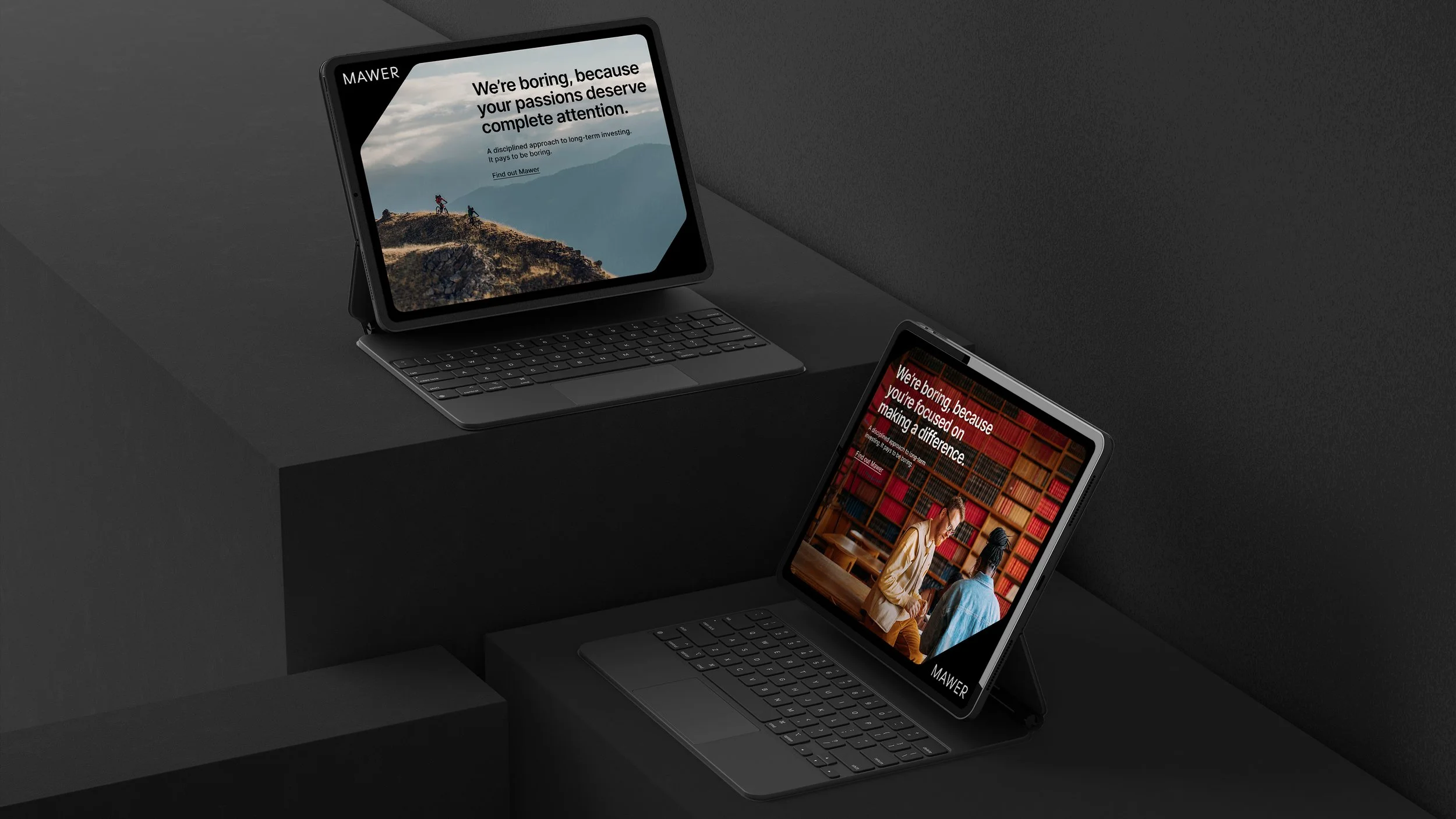
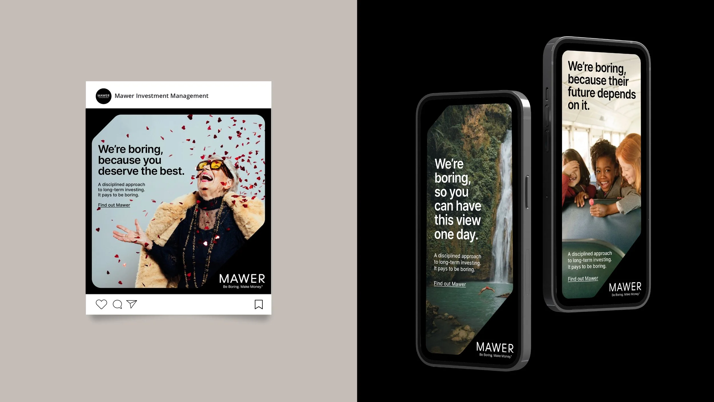
Mawer aimed to build brand awareness among DIY investors by expressing its “Be Boring. Make Money™” philosophy in a modern, aspirational way—while staying true to the existing brand.
My Approach
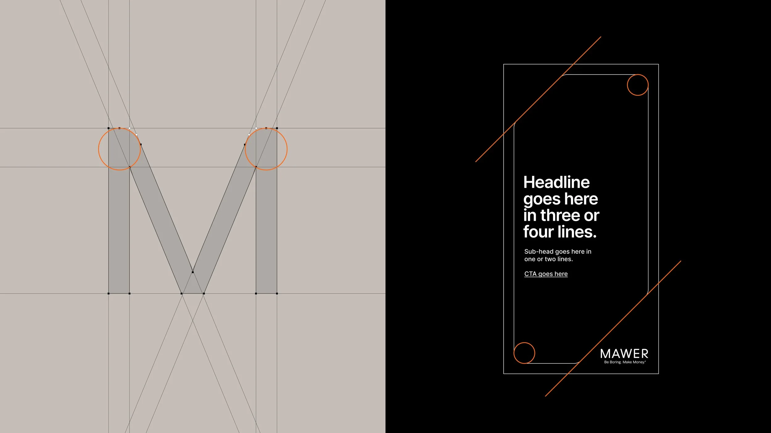
I created a visual system inspired by the rounded geometry of the Mawer logotype. Using black as the primary color and extending the logo’s softened corners into a modular design language, the campaign feels calm, confident, and unmistakably Mawer.

The Result
The campaign introduces a distinctive, ownable look that elevates Mawer’s long-term investing philosophy. The visual system strengthens brand recognition, the messaging resonates with disciplined investors, and every execution reinforces a simple truth: it pays to be boring.